Apple’s Design System Explained: HIG, Liquid Glass and What iOS 26 Changed
Apple's design system explained in plain words: the Human Interface Guidelines, SF fonts and symbols, and the Liquid Glass look iOS 26 brought, plus where to get the official Figma kits.
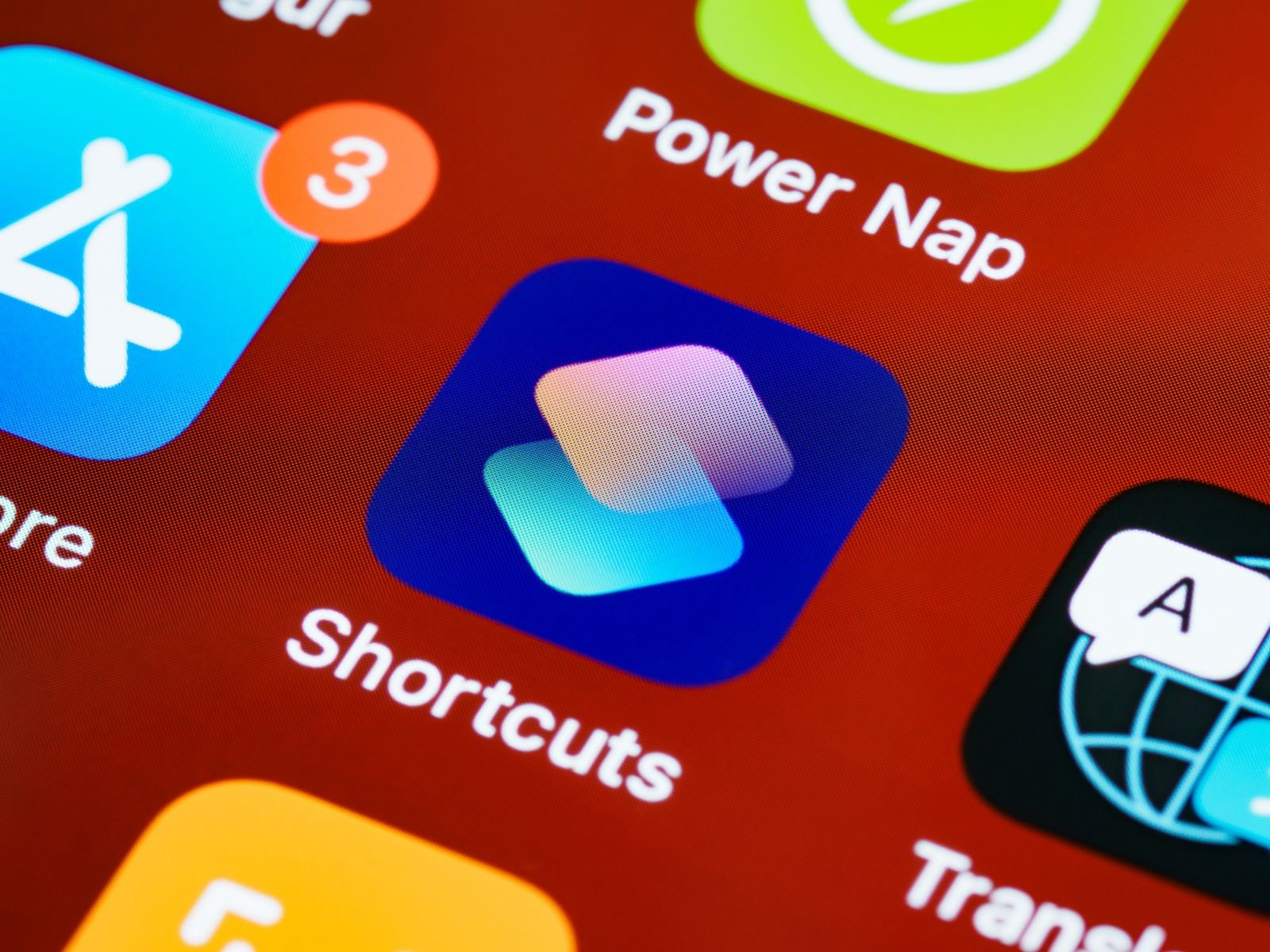
Ask ten designers what “Apple’s design system” is and you’ll get ten different answers. Some say it’s the Human Interface Guidelines. Some say it’s the San Francisco font. Some just wave vaguely at their iPhone and say “you know… this.” They’re all partly right. Apple’s design system isn’t one downloadable file, it’s a stack of guidelines, fonts, icons, components and (since iOS 26) a whole new material called Liquid Glass that ties everything together.
If you’re designing or building an app for iPhone or Mac in 2026, you need to understand this stack, because Apple has made it very clear that apps which ignore it will look dated fast. We’ve been rebuilding our own test apps around the new system since the iOS 26 betas dropped, and this guide covers everything we learned: what the system actually consists of, the principles behind it, what Liquid Glass changed, and where to grab the official design kits.
What Apple’s Design System Actually Is
Unlike Google’s Material Design, Apple never gave its system one catchy brand name. What it ships instead is a set of pieces that work together:
- The Human Interface Guidelines (HIG). The written rulebook. It covers layout, navigation, color, typography, accessibility and per-platform conventions for iOS, iPadOS, macOS, watchOS, tvOS and visionOS. Apple merged everything into one unified document a few years back, so you read shared guidance first and platform quirks second.
- San Francisco (SF) fonts. SF Pro for iOS and macOS, SF Compact for watchOS, plus SF Mono and the rounded variants. They’re optically tuned so text stays legible at tiny sizes, and they support Dynamic Type out of the box.
- SF Symbols. A library of over 7,000 icons drawn to match the SF fonts, with built-in weights, scales and animation presets. If you’re still exporting icons from Figma as PNGs, stop, SF Symbols will save you days.
- System components. Buttons, tab bars, navigation bars, sheets, alerts, toggles. These come “for free” in SwiftUI and UIKit, and they automatically pick up new system styling (which mattered a lot when iOS 26 landed, more on that below).
- Liquid Glass. The new dynamic material introduced at WWDC 2025 that now defines how controls look and behave across every Apple platform.
The point of all this is consistency. When your app uses the system pieces, users already know how it works before they’ve opened it. That’s a massive head start you’d be silly to throw away.
The Core Principles: Clarity, Deference, Depth
Apple’s design philosophy has rested on three words since the iOS 7 era, and iOS 26 doubles down on all of them. Here’s what they mean in plain language:
- Clarity. Text is legible at every size, icons are precise, and nothing decorative gets in the way of the job. If a user has to squint or guess, you’ve failed this one.
- Deference. The interface serves the content, not the other way around. Chrome (bars, buttons, backgrounds) should recede so photos, text and video take center stage. Liquid Glass is basically deference turned into a material: controls literally let content show through them.
- Depth. Layers and motion tell you where you are. Sheets slide up over content, glass elements float above the page, transitions show hierarchy. Depth isn’t decoration, it’s navigation.
We wrote a full breakdown of how these principles translate into App Review expectations in our guide to iOS app design principles and what Apple expects from good apps, which pairs nicely with this article.
Liquid Glass: What iOS 26 Actually Changed
Liquid Glass is the biggest visual overhaul since iOS 7 flattened everything in 2013. Announced at WWDC 2025 and shipped with iOS 26, it’s a translucent material that behaves like real glass: it refracts the content behind it, bends light around its edges (Apple calls this lensing), catches specular highlights when you move the device, and morphs fluidly as controls change state.
In practice, here’s what changed on your iPhone:
- Tab bars and navigation bars float. They no longer sit as flat opaque strips. They hover above content as rounded glass elements, and tab bars shrink when you scroll to give content more room.
- Controls are grouped in glass “islands.” Buttons cluster into capsule shapes that expand and morph when tapped.
- App icons got a new layered look. Icons are built from stacked glass layers, and users can pick default, dark, clear or tinted renderings. Apple’s new Icon Composer tool exists specifically for this.
- It’s everywhere, not just iOS. The same material runs across iPadOS 26, macOS Tahoe 26, watchOS 26, tvOS 26 and visionOS 26. Design once, and it translates.
One thing worth saying out loud: early betas were divisive. People complained about legibility, and Apple dialed the transparency up and down across several beta cycles before settling. The shipping version adapts intelligently, glass gets frostier over busy backgrounds so text stays readable, and users who hate it can reduce transparency in Accessibility settings. Point releases through iOS 26.x have kept tuning it, including more user control over tinting.
Liquid Glass is only one of the headline changes in the release. Our roundup of iOS 26 features covers the rest of what shipped alongside it.
Old System vs. Liquid Glass at a Glance
| Element | Before iOS 26 | With Liquid Glass (iOS 26) |
|---|---|---|
| Tab bar | Flat, opaque or blurred strip pinned to the bottom edge | Floating glass capsule that shrinks on scroll |
| Navigation bar | Solid or blurred bar spanning full width | Translucent glass elements that let content scroll beneath |
| Buttons | Flat tinted text or filled rectangles | Glass capsules with refraction and press morphing |
| App icons | Single flat image in a rounded square | Layered glass with default, dark, clear and tinted modes |
| Alerts and sheets | Blurred cards | Glass panels with lensing and adaptive shadows |
| Design tooling | Per-platform Sketch and Figma templates | Unified iOS and iPadOS 26 Figma kit plus Icon Composer |
Practical Advice for Adopting the System
Here’s the playbook we’d follow (and did follow) when moving an app to the iOS 26 look:
- Rebuild with the current SDK and see what you get free. If your app uses standard SwiftUI or UIKit components, simply compiling against the iOS 26 SDK gets you most of the Liquid Glass treatment automatically. On my M2 Air this took an afternoon for a mid-size app, and 80 percent of screens just worked.
- Kill your custom navigation chrome. Custom tab bars and hand-rolled headers are the number one thing that breaks. Where you can, swap them for system components so you inherit future changes too.
- Use glass sparingly in your own UI. Apple gives developers APIs (like SwiftUI’s glass effect modifiers) to apply the material to custom views. Resist the urge to glass everything. The system works because glass marks interactive chrome, not content.
- Test legibility over real content. Translucency looks gorgeous over a demo gradient and terrible over a busy user photo. Test with worst-case content, in light and dark mode, and with Reduce Transparency switched on.
- Redo your icon in Icon Composer. A flat legacy icon inside iOS 26’s layered treatment looks off. Budget an hour or two to rebuild it in layers, then check all four rendering modes.
- Mind the deadline. Apple has told developers that apps should fully adopt the new design going forward; builds submitted with the latest SDKs get the new appearance by default, and the compatibility opt-out is temporary. Don’t be the app that still looks like iOS 18 in 2027.
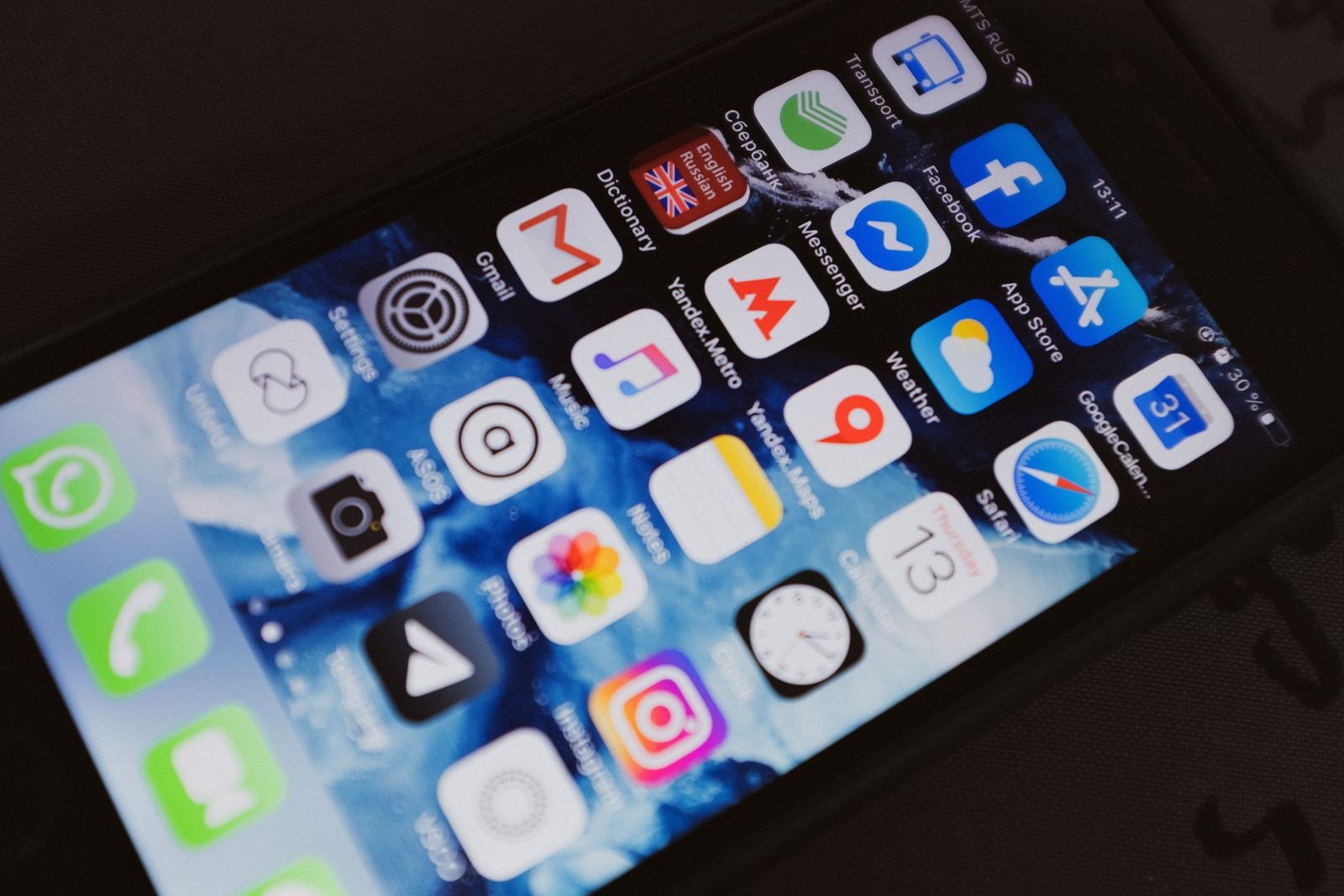
Where to Get the Official Design Kits
Apple hosts everything on its Apple Design Resources page at developer.apple.com/design/resources. Here’s what to grab:
- iOS and iPadOS 26 UI Kit for Figma. The official kit, free on Figma Community, with Liquid Glass components, system colors, corner radii and layout templates. Apple has gone all-in on Figma, so Sketch users are increasingly on their own.
- macOS and watchOS templates. Separate libraries for the other platforms, updated for Tahoe’s glass styling.
- SF Pro, SF Compact and SF Mono fonts. Free to download for designing Apple-platform apps. Install these before opening the Figma kit or every text layer will fall back to something ugly.
- The SF Symbols app. A free Mac app for browsing all 7,000+ symbols, testing weights and previewing animations.
- Icon Composer. Apple’s tool for building the new layered icons, bundled with the Xcode 26 toolchain.
If you’re heading from design into code, our Apple app development guide walks through the whole build process, and the same design system applies on the desktop side too, which we cover in our macOS app development guide.
FAQ
Is Apple’s design system free to use?
Yes, with a catch. The HIG, fonts, SF Symbols and Figma kits are all free, but the licenses restrict them to designing and building software for Apple platforms. You can’t use SF Pro on your marketing site or ship SF Symbols in an Android app.
Do I have to adopt Liquid Glass?
Effectively, yes. Once you build with the iOS 26 SDK, system components render in the new style by default. Apple offered a temporary opt-out key for compatibility, but it’s been clear that it’s going away with the next SDK cycle. Plan the redesign now rather than being forced into it later.
What’s the difference between the HIG and the design system?
The HIG is the written guidance, the “why” and “when.” The design system is the broader set of actual materials: fonts, symbols, components, kits and now the Liquid Glass material itself. You need both, since the kits show you what things look like and the HIG tells you how to use them well.
Does Liquid Glass hurt battery life or performance?
All that real-time refraction isn’t free, but Apple renders it efficiently on modern chips. On anything from roughly the A13 onward it’s smooth in daily use, and in our testing the difference in battery drain was too small to notice. Older supported devices see slightly simplified effects.